


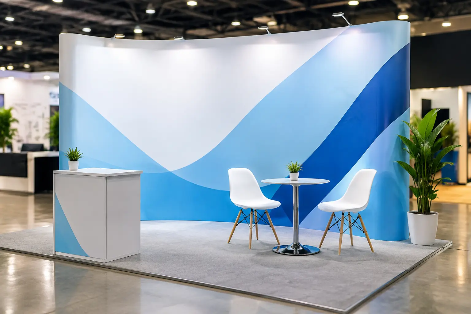
A crowded exhibition hall gives your brand only a few seconds to earn attention. Visitors are scanning aisles, looking for familiar names, useful solutions, and booths that feel credible before anyone starts a conversation. Knowing how to design exhibition backdrops means designing for that real viewing behavior, not simply filling a large panel with a logo and product information.
A strong backdrop makes your booth easy to recognize from a distance, gives visitors a reason to approach, and supports the work your team is doing on the floor. It also needs to survive practical realities: limited booth space, venue lighting, viewing angles, installation time, print specifications, and a deadline that rarely moves.
Start With One Job for the Backdrop
Before selecting colors, images, or materials, decide what the backdrop must accomplish. For many corporate exhibitors, it should establish brand presence and explain a core offer in one glance. For a product launch, the priority may be creating a visual focal point around the new product. At a recruitment fair, it may need to communicate culture, roles, and a clear reason to speak with the team.
Trying to make one backdrop perform every marketing function usually creates clutter. Your brochure, screen presentation, samples, and sales team can provide detail. The backdrop should carry the high-value information that remains visible when the booth is busy.
A useful starting point is a simple hierarchy: your logo or brand identifier, one concise message, and one supporting visual or proof point. If a visitor can understand those elements from several steps away, the design is doing its primary job.
How to Design Exhibition Backdrops for Distance
Designing on a laptop can be misleading. A message that looks balanced on screen may become unreadable from 10 or 15 feet away. Build the layout around the distance from which it needs to work.
Make the main message large enough
Your headline should be short, specific, and easy to absorb. “Custom corporate merchandise for every campaign” is clearer than a long paragraph describing every service you offer. Save detailed capabilities, specifications, and contact information for lower sections of the booth or take-home materials.
Use a font size and weight that can be read across the aisle. Thin typefaces and tightly spaced uppercase text may look polished in a presentation, but they lose impact at event scale. Choose a clean, high-contrast typeface and give the words room to breathe.
Create a clear visual path
Most people will not read a backdrop from left to right as they would a report. Their eye lands first on a large image, bold color area, or logo. From there, guide them toward the message and then to the call to action.
Place the most important content in the upper and central areas of the backdrop, where it is less likely to be blocked by counters, furniture, product displays, or people standing in the booth. Keep logos away from extreme edges and avoid putting vital text near floor level.
Use contrast, not just brand colors
Brand consistency matters, but a backdrop still needs to be legible under mixed venue lighting. A pale logo on a busy photograph or dark text over a mid-tone background can disappear quickly. High contrast between text and background is usually more valuable than trying to use every brand color.
If your visual identity relies on subtle colors, use a solid color block or a carefully darkened image behind the copy. This protects readability while keeping the design recognizably on-brand.
Match the Layout to Your Booth Format
A pull-up banner, fabric wall, modular booth panel, and full custom exhibition wall have different design needs. Do not assume artwork can simply be enlarged from one format to another.
For a narrow backdrop, use a strong vertical composition with one message and limited imagery. For a wide wall, create zones that can be understood independently, especially if visitors will approach from different directions. A corner booth may benefit from visual continuity across both visible sides, while an open booth needs the branding to work without relying on a single front-facing viewpoint.
Ask for the final visible dimensions, not only the overall print size. Frame systems, pole pockets, trims, and mounting hardware can reduce the usable area. A production partner should also provide an artwork template showing bleed, safe areas, and any sections that will be obscured or wrapped around a frame.
Consider what sits in front of the backdrop. If you are using a reception counter, product shelves, monitors, or live printing equipment, map their positions before finalizing the layout. The most common avoidable mistake is placing a key message exactly where a staff member will stand all day.
Choose Images That Hold Up at Large Scale
A low-resolution image can look acceptable in a small online preview and still print soft, pixelated, or unprofessional on a large display. Use high-resolution original photography, professionally prepared graphics, or vector artwork wherever possible.
Images should earn their space. A strong product image, a real event photograph, or a carefully selected lifestyle visual can quickly show what your business does. Generic stock imagery may fill the panel, but it often makes a booth feel interchangeable. For service businesses, showing the work, the products, or the people behind the service usually creates more trust.
Avoid using several unrelated images unless each one serves a defined purpose. One dominant image paired with a simple message generally has more impact than a collage of small visuals competing for attention.
If you must use product photos, allow enough clear space around them. Crowded cutouts, overlapping shadows, and tiny captions can make a large-format design feel like a catalog page rather than a confident exhibition presence.
Include a Call to Action People Can Actually Use
A backdrop is not always the right place for a detailed sales pitch, but it should help interested visitors take the next step. That may be “Ask us about on-site printing,” “View our corporate gift range,” “Book a consultation,” or a short prompt directing visitors to speak with the team.
A QR code can work when the action is genuinely useful, such as accessing a product catalog, booking a meeting, or entering a giveaway. Keep it large enough to scan easily and place it where visitors can reach it without blocking the booth. Test it from the expected scanning distance before production.
Do not rely on a QR code as the only explanation of your offer. A visitor should understand why they should scan before they take out their phone.
Design for Print Production, Not Just Approval
Artwork approval is only one part of a successful backdrop project. The final result depends on the material, print method, finishing, and installation environment.
Fabric backdrops are lightweight, portable, and often reduce glare under exhibition lighting. They can be an excellent choice for repeat use, although folds and tension need to be handled correctly during setup. PVC or vinyl displays offer strong color and durability, particularly for certain banner and panel systems, but they may create reflections in bright halls. Rigid boards provide a clean, structured appearance for short-term installations, while modular systems are practical when booth sizes change across events.
Color is another practical consideration. Screen colors do not always reproduce exactly in print, particularly bright blues, fluorescent shades, and very dark color fields. Supply brand color references when available, and request a proof or sample for color-sensitive campaigns. If the backdrop needs to match apparel, giveaways, counters, or other event materials, plan all items together rather than approving each one in isolation.
Prepare source files properly. Vector logos, outlined or packaged fonts, linked images, and correctly sized artwork help reduce last-minute delays. A reliable printing partner can check files before production, but early artwork review gives more room to correct resolution, bleed, and layout issues without putting pressure on the event schedule.
Plan the Backdrop as Part of the Whole Booth
The best backdrop is not a standalone decoration. It should work with your table wraps, brochures, uniforms, product displays, giveaways, and team messaging. Repeating the same headline or visual language across these elements helps visitors remember who you are after they leave the hall.
This does not mean every surface needs the same logo at maximum size. Good booth branding uses repetition with restraint. The backdrop can carry the main campaign message, while staff apparel creates recognition, counters add practical information, and promotional items give visitors something tangible to keep.
For organizations managing several suppliers, this coordination can become the difficult part. Working with one experienced production and event branding partner can simplify artwork management, color matching, delivery timing, and booth setup. Global Asia Printings supports this kind of end-to-end planning, from branded merchandise and printed materials to exhibition booth installation.
Build in Time for Testing and Setup
Never make the event day the first time anyone sees the backdrop at full scale. Review a scaled proof, check every line of text, confirm phone numbers and QR codes, and inspect the design against the booth plan. If possible, test the display with the actual counter or furniture in place.
Allow time for venue access rules, installation, and unexpected adjustments. Some venues have strict setup windows or require approved materials. A backdrop that is perfectly printed but arrives without the correct hardware, or does not fit the allocated space, can create unnecessary stress for the event team.
A backdrop should make the first conversation easier. When the message is visible, the design is clear, and the production is handled properly, your team can spend less time explaining who you are and more time building valuable connections.