


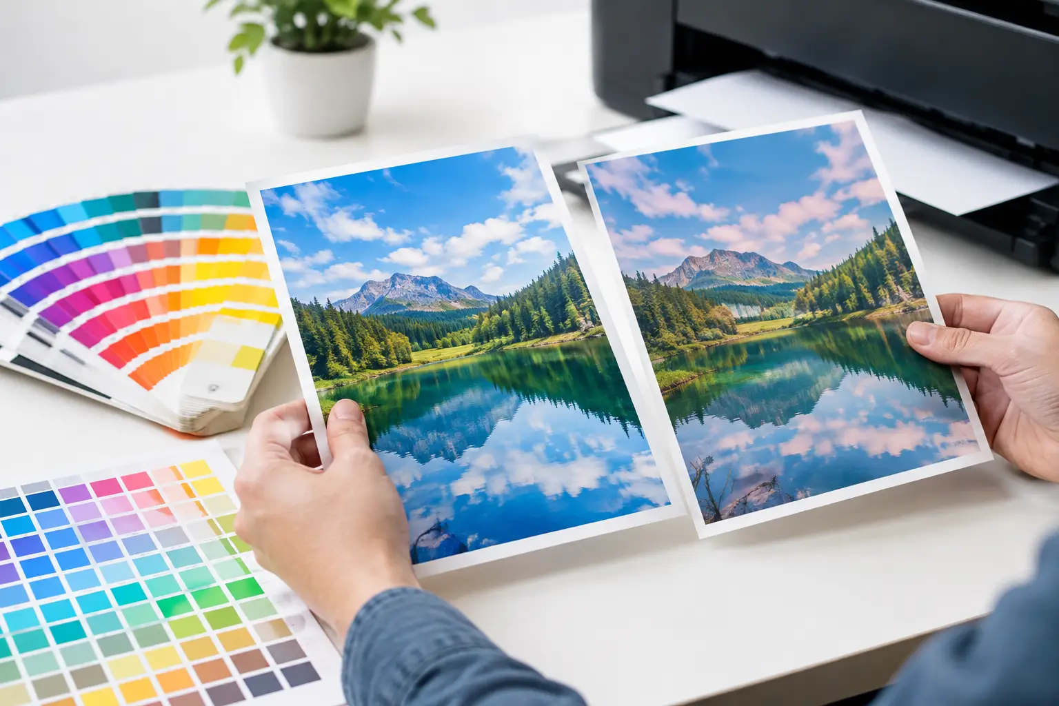
A navy logo that looks crisp and deep on a laptop can arrive looking lighter on a polo shirt. A warm brand orange may appear redder on a tote bag than it did on a brochure proof. If you have ever asked, why do printed colors vary, the short answer is that a digital preview, an ink formula, and a physical product do not create color in the same way.
For corporate merchandise, this is not a minor technical detail. Color affects brand recognition, perceived quality, and whether a campaign looks coordinated across uniforms, gifts, signage, and event materials. Managing it well starts with knowing where variation comes from and making the right production choices before a full order goes to print.
Why Do Printed Colors Vary From Screen to Product?
The screen in front of you produces color with light. Printing creates color with ink, toner, thread, or film on a physical surface. These are fundamentally different systems, so an exact visual match is not always possible.
Screens use RGB – red, green, and blue light – to create a wide range of bright colors. Most commercial printing uses CMYK – cyan, magenta, yellow, and black inks – to reproduce color by reflecting light. Some decoration methods use specially mixed spot colors, while embroidery uses colored threads chosen from an available thread range. Each method has its own limits.
That difference becomes especially noticeable with bright blues, fluorescent shades, deep blacks, metallic effects, and highly saturated greens or oranges. A screen can display colors that standard process inks cannot reproduce. When artwork is converted from RGB to CMYK, the production file may need to substitute the nearest printable color rather than the exact screen color.
Screens Are Not a Reliable Final Proof
Two people can view the same artwork on different monitors and see different results. Screen brightness, display settings, age, and ambient light all change perception. A phone set to vivid display mode may make a logo look more saturated than a calibrated office monitor.
Digital mockups remain useful for checking placement, scale, and overall design direction. They should not be treated as a precise physical color proof, particularly for brand-critical campaigns or large quantities. A printed sample on the actual item is the more dependable decision point.
The Material Changes the Result
Ink does not sit the same way on every surface. Paper, cotton, polyester, canvas, plastic, metal, wood, and coated gift boxes each absorb, reflect, or hold ink differently. The same approved color can therefore look noticeably different across products.
A matte uncoated paper stock absorbs more ink and can make colors appear softer than a glossy coated stock. On cotton apparel, ink may sink slightly into the fibers and produce a more natural finish. On polyester, the fabric’s smooth surface and dye behavior can change how the printed color reads. Dark garments often need a white underbase beneath the design, which can make colors more opaque but may also alter their final tone.
Texture matters too. A logo printed on a smooth ceramic mug will look different from the same logo on woven canvas or a ribbed water bottle. With embroidered uniforms, thread direction and stitch density can make a color appear lighter or darker across a larger logo area.
This is why one brand color should not be judged in isolation. The practical goal is visual consistency across the full set of campaign materials, not an impossible promise that every substrate will reproduce an identical shade.
Print Method Has a Major Role
Different printing processes are selected for different materials, quantities, turnaround needs, and design requirements. They also produce color differently.
Screen printing is widely used for apparel and bags because it delivers solid, durable color, especially for simple designs with defined spot colors. A mixed spot ink can provide strong brand consistency, but the result still depends on fabric type, garment color, and the curing process.
Digital printing is well suited to full-color artwork, gradients, photographs, and variable designs. It offers flexibility, but digital inks have their own color gamut and may behave differently on coated versus uncoated products. Direct-to-film and direct-to-garment printing can achieve detailed apparel graphics, though the feel and color result depend on the fabric and base layer.
Heat transfer methods are useful for short runs, names, numbers, and certain specialty materials. Sublimation produces vibrant, durable results on suitable polyester products, but it is generally intended for light-colored polyester surfaces. UV printing works well for many hard goods such as electronics, drinkware, and promotional accessories, yet curved surfaces and material coatings can affect appearance.
The right method is not simply the one that produces the brightest color. It is the one that fits the product, artwork, quantity, budget, durability expectations, and desired finish.
Lighting Can Make an Approved Color Look Wrong
A printed item may look excellent under bright office lighting and different under warm event lighting, daylight, or retail spotlights. This effect is especially common with grays, blues, blacks, and neutral tones.
Color perception changes because every light source has a different color temperature and spectral output. Warm indoor lighting can add a yellow cast. Cool LEDs can make some colors look sharper or bluer. Daylight changes throughout the day as well.
For an event program, this is worth discussing early. If branded backdrops, staff apparel, giveaway items, and printed collateral will all be seen under venue lighting, review samples under similar conditions where possible. A color that works on a desk may not read the same way in a ballroom or outdoor activation.
Small Production Factors Add Up
Even within a single print method, normal production tolerances exist. Ink density, drying time, curing temperature, machine calibration, humidity, and batch-to-batch material variation can all create small shifts.
For example, a repeat apparel order may use a new garment batch that is slightly different in fabric weave or base shade. A new run of uncoated notebooks may have paper that absorbs ink differently from the previous shipment. These changes do not necessarily indicate poor quality. They are part of working with physical materials at production scale.
The risk becomes greater when a project is split among multiple vendors or ordered in separate batches without shared specifications. That is where a coordinated production approach helps. Keeping approved artwork, color references, product details, and print settings together makes future repeat orders easier to manage.
How to Get More Consistent Printed Color
The most effective color control happens before production begins. Start with the strongest available brand assets. Vector artwork is preferred for logos because it preserves clean edges and makes spot-color matching easier. If your organization has official Pantone or other spot-color references, provide them with the artwork rather than relying only on a screenshot or an RGB value.
Be clear about what matters most. Is the priority an exact logo shade on a white exhibition wall, a visually close match across multiple giveaways, or a vibrant design within a fixed event budget? Those are different objectives, and they may call for different products or methods.
For larger orders, unfamiliar products, or highly visible brand launches, request a physical proof or pre-production sample. This adds time and cost, but it is often worthwhile when thousands of items will be distributed or when several materials need to appear together. Review the sample for more than color: check logo size, placement, legibility, finish, and how the design looks at normal viewing distance.
A practical approval process should also account for the substrate. Approving a logo on paper does not automatically approve it for a black polo, textured tote, or stainless steel bottle. Ask for expectations by product type, especially when one campaign includes mixed merchandise.
At Global Asia Printings, this production discussion is part of helping corporate teams choose items and decoration methods that suit both their brand standards and their delivery schedule. Early guidance is particularly valuable when a campaign combines apparel, gifts, event materials, and on-site activation elements.
When an Exact Match Is Essential
Some projects have very little room for interpretation. Franchise branding, financial institutions, regulated products, premium client gifts, and major product launches may require tightly controlled color. In these cases, specify the approved color standard, request a physical proof, and avoid last-minute substitutions of product, material, or print method.
There are trade-offs. Spot-color printing can offer better consistency for a simple logo, but it may not be economical for every low-volume or full-color design. Digital printing gives greater artwork flexibility, but may be less exact for certain saturated corporate colors. A dependable supplier should explain those trade-offs plainly before production, not after delivery.
The best question is not whether printed color will vary at all. It will, to some degree. The better question is whether the expected variation is acceptable for the product, audience, and purpose. When the artwork, material, print method, proofing process, and event environment are considered together, branded items can look intentional, consistent, and ready to represent your organization well.
Before approving your next order, compare the design against the actual product and the setting where it will be used. That one practical check can prevent a small color difference from becoming a visible campaign problem.