


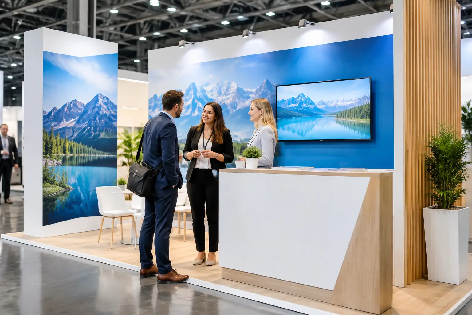
A busy trade show floor gives your booth only a few seconds to earn a visitor’s attention. Exhibition graphics are what make those seconds count. Before a conversation starts, your walls, banners, counters, and displays should tell people who you are, what you offer, and why they should stop.
For marketing teams, event planners, and corporate coordinators, this is not simply a printing decision. It is a practical brand presentation decision involving message hierarchy, viewing distance, venue rules, installation time, and budget. The strongest graphics do not try to say everything. They make the right thing easy to see.
Start With the Booth’s Job
Every exhibition booth has a primary job. It may need to generate sales leads, launch a product, recruit talent, support a dealer meeting, or reinforce brand awareness. The objective determines what your graphics need to do.
A lead-generation booth should make its value proposition immediately clear, then create an obvious reason to speak with the team. A product launch may need a large hero visual and a concise explanation of what is new. A recruitment booth benefits from people-focused imagery, a clear employer message, and a welcoming layout that does not feel like a sales counter.
Trying to combine every campaign message, product category, company milestone, and social media prompt on one back wall usually weakens the result. Decide what a passerby should understand from several feet away, what they should learn at the booth edge, and what your staff can explain in conversation. This simple hierarchy makes artwork more effective and keeps production decisions focused.
What Effective Exhibition Graphics Include
Good booth graphics balance three things: visibility, clarity, and brand consistency. A large logo alone may establish ownership, but it rarely gives visitors a reason to engage. A detailed product chart may be useful during a conversation, but it is not a headline.
Your main graphic should usually contain a recognizable brand element, one concise message, and a visual that supports the message. If you sell a service, show the outcome or the people who benefit from it. If you sell physical products, use high-quality product imagery at an appropriate scale. If the offer is complex, reduce it to a strong benefit statement rather than a paragraph of explanation.
Color matters, but contrast matters more. Brand colors should be used faithfully while keeping text readable under exhibition hall lighting. Light type on a busy image, low-contrast color combinations, or fine lines can look acceptable on a laptop and disappear in a venue. Viewing a proof at actual or near-actual size is often more valuable than reviewing another small screen mockup.
Design for the Distance, Not Just the Screen
Visitors encounter a booth in stages. From across an aisle, they notice shape, color, logo placement, and a short headline. At closer range, they can read supporting text, examine product images, and notice calls to action. At the counter, they may scan a QR code, take a brochure, or ask a specific question.
This means large-format graphics need fewer words and larger type than a flyer. A useful rule is to reserve the biggest type for the message that must be read from a distance. Secondary details belong lower in the layout or on supporting materials such as tabletop signs, brochures, digital screens, and product cards.
QR codes can be helpful, particularly for catalogs, registration pages, or post-event offers. They should not replace a clear booth message. Give the code breathing room, test it at printed size, and include a short explanation of what visitors receive when they scan it.
Choose the Right Graphic Format for the Booth
The best format depends on your floor space, booth structure, frequency of use, transport needs, and installation conditions. A well-planned mix often performs better than investing all available budget in one large feature wall.
For a compact booth, a printed back wall, retractable banners, counter graphics, and a branded table cover can create a complete presence without adding unnecessary complexity. The back wall carries the main message, while banners can highlight product categories, service benefits, or a campaign offer.
For larger spaces, fabric walls, modular panels, suspended signs, lightboxes, vinyl wall graphics, floor graphics, and custom-built structures offer more opportunity to guide visitor movement. These formats can create stronger visual impact, but they also require careful planning for power access, venue rigging approval, storage, and installation schedules.
Portable graphics are a sensible choice for organizations attending multiple events. They reduce replacement costs and can be adapted with updated panels or campaign elements. Custom-built booth graphics are more suitable when the exhibition is strategically important and the space needs to support demonstrations, meetings, product displays, or hospitality.
Material selection should be practical, not purely visual. Fabric graphics are lightweight, generally easy to transport, and well suited to reusable frames. Rigid boards can provide a clean, structured finish for counters and displays. Vinyl is useful for walls, windows, and selected surfaces, provided the venue allows it and the application surface is suitable. The right choice depends on the site, expected lifespan, and how often the graphic will be handled.
Prepare Artwork Before Production Becomes Urgent
Last-minute artwork is one of the most common causes of exhibition stress. It can lead to rushed approvals, incorrect dimensions, pixelated images, color surprises, and missed installation windows. A production-ready artwork process protects both the brand and the event timeline.
Start with confirmed booth dimensions and identify every surface that will receive graphics. Ask for the exact visible area, not only the overall structure size. Frames, channels, door openings, shelves, screens, and lighting fixtures can affect where key content should sit. For large walls, consider panel joins and avoid placing faces, logos, or essential words directly across a seam.
Use high-resolution images and vector logo files whenever possible. Vector artwork retains sharp edges when scaled, which is particularly important for logos, icons, and text. Images taken from websites or messaging apps are often too small for large-format printing, even if they look fine on a phone.
Colors should be reviewed with the final print method and material in mind. Digital displays use light, while printed graphics use ink on a physical surface. Exact color matching can vary by substrate, finish, and lighting. When brand color is critical, request guidance early and allow time for a proof or sample where appropriate.
A reliable supplier should also flag production concerns before printing begins. This includes low-resolution artwork, unsafe text margins, unsuitable QR code sizing, missing bleed, and installation issues. The goal is not simply to print the supplied file. It is to make sure the finished graphics perform correctly at the event.
Plan the Installation as Part of the Design
Exhibition graphics can look excellent in a mockup yet fail operationally if installation has not been considered. Venue access hours may be limited. Loading bays can be congested. Some halls require approved contractors, specific fire-rated materials, or prior permission for hanging signs and floor decals.
Confirm who is responsible for delivery, setup, electrical coordination, dismantling, and post-event collection. If the booth includes multiple graphic elements, label each item clearly and prepare an installation plan so the team knows where every panel, banner, and counter wrap belongs.
This is where an end-to-end partner is especially valuable. Global Asia Printings can coordinate graphic production alongside booth setup and branded event materials, reducing the risk of artwork being passed between separate vendors with different assumptions. One coordinated workflow makes it easier to align dimensions, schedules, finishing, and on-site requirements.
Spend Where Visitors Will Notice
Budget decisions should follow visitor impact. The primary back wall, entrance-facing message, and key product display areas are usually worth prioritizing because they influence first impressions. Supporting items can then be selected based on the event format and expected traffic.
Do not assume that more graphics always mean a better booth. Too many banners can make a small space feel crowded, while too much text gives staff less room to start a natural conversation. Conversely, a large booth with only a logo wall may feel unfinished and give visitors little direction.
It also helps to separate reusable components from event-specific campaign elements. Invest in durable core graphics that reflect your brand, then update smaller panels, decals, or messaging areas for different launches and audiences. This approach can give repeat exhibitors better value over time without making every appearance look identical.
Give Your Team a Booth They Can Use
The final test of exhibition graphics is not whether they look impressive in a design presentation. It is whether they help real people find the booth, understand the offer, and begin a useful conversation. Before approving artwork, stand back from the proof and ask what a visitor will notice first, what they will understand next, and where your team will take the conversation from there.
When those answers are clear, your graphics become more than event decoration. They become working tools for a better-organized, more confident booth experience.