


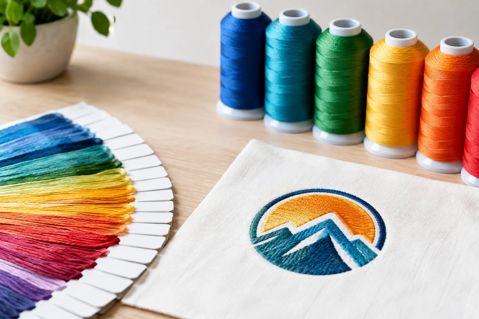
A logo that looks sharp on a presentation slide can lose its impact once it is stitched onto a polo, jacket, tote, or cap. That is why knowing how to select embroidery thread colors is a production decision, not just a design preference. For corporate uniforms and event merchandise, the right thread choices protect brand recognition while ensuring the finished item remains clear, professional, and consistent across an entire order.
Embroidery uses real thread, texture, and stitch direction. It does not reproduce color in the same way as a digital screen or printed artwork. A practical color plan accounts for the logo, the base fabric, the size of the embroidery area, and the viewing distance. Getting those factors right before production helps avoid costly revisions and keeps your apparel program on schedule.
Start With Your Approved Brand Colors
Your approved brand guidelines should always be the first reference point. If your organization has Pantone references, CMYK values, RGB values, or a defined logo file, provide them with the artwork when requesting a quote or production proof. This gives the embroidery team a reliable starting point for matching available thread shades.
However, thread matching is an approximation rather than a direct conversion. Screen colors are made with light, while embroidery thread reflects light and has a visible sheen. A bright blue may appear deeper in rayon thread; a pale yellow may look less visible when stitched onto a white polo. The objective is not to force an exact digital match where one is not possible. It is to choose the closest thread colors that preserve the character and recognition of your brand.
For large corporate orders, request a thread chart or physical sew-out when color accuracy is particularly important. This is especially useful for established brand identities, sponsor logos, school crests, and client-facing uniforms. A physical sample shows what a digital mockup cannot: how the thread reflects light, how densely it stitches, and how it sits against the chosen fabric.
How to Select Embroidery Thread Colors by Contrast
Contrast is the factor most likely to determine whether embroidered branding is legible from a normal viewing distance. A logo may use the correct official color but still disappear if the thread value is too close to the garment color.
Think beyond whether colors are different. Consider whether they are light or dark. Navy thread on black fabric, dark green thread on charcoal, or medium gray thread on heather gray may technically be distinct, but the logo can look flat from a few feet away. In these cases, a white, silver, or lighter brand-approved alternative may deliver a more useful result.
The same issue applies to light garments. White embroidery on pale gray, beige, or pastel apparel often lacks enough definition. A darker outline or a stronger secondary logo color can make the embroidery easier to read without changing the overall identity.
For most uniforms, one or two thread colors produce the cleanest outcome. More colors can work well for an emblem, mascot, or campaign mark, but each added color creates more visual detail and may increase setup or production complexity. If the logo will be embroidered small on a chest, sleeve, or cap, simplifying the color treatment often improves clarity.
Use an Outline Selectively
An outline can separate light artwork from a light garment or dark artwork from a dark garment. It is helpful when a logo contains white text, fine icons, or several adjacent colors. But it is not automatically the answer.
A thin outline can become uneven or crowded at small sizes, while a heavy outline may make the logo look harsher than intended. The production team should assess the final embroidery dimensions before recommending one. In some cases, changing the garment color is a better solution than adding an outline to every logo.
Match the Thread to the Fabric and Product
The same embroidery colors can look different on a smooth cotton polo, textured pique fabric, fleece jacket, canvas bag, or structured cap. Fabric texture changes the way thread catches light and how cleanly small details appear.
Smooth, stable fabrics generally support sharper lettering and more precise color boundaries. Textured knits and thicker materials can make fine lines look less defined. On these products, a high-contrast, simplified logo is usually more reliable than a detailed multicolor mark.
Garment color also affects the perceived thread shade. White thread can look cool against navy and warm against cream. Metallic or glossy threads can appear premium under indoor lighting but may create glare in photos or under event spotlights. For workwear, staff uniforms, and repeat-use corporate apparel, standard rayon or polyester embroidery threads are often the most practical choice because they provide consistent color and durability.
Polyester thread is particularly suitable when items will be washed frequently or used outdoors, such as sportswear, operational uniforms, and event crew apparel. Rayon offers a soft sheen that can look refined on premium polos, jackets, and gift items. The better option depends on the product use, expected care, and desired finish.
Consider Size Before Finalizing Colors
A full-color logo does not always translate well into a small embroidery area. Chest logos are commonly compact, and cap front panels can be even more restrictive. At a small scale, thin text, color gradients, tiny gaps, and closely placed shapes may merge together.
Before confirming thread colors, confirm the actual logo dimensions. A design that measures three inches wide may accommodate several colors and fine details. The same design at two inches wide may require simplified lettering, fewer thread changes, or a single-color version.
This is where having approved logo variations is valuable. Many organizations benefit from maintaining a primary full-color logo, a simplified embroidery logo, and a one-color option. These are not compromises in brand quality. They are production-ready tools that allow the brand to remain recognizable across polos, caps, bags, jackets, and promotional accessories.
Avoid gradients whenever possible. Embroidery cannot blend thread colors as smoothly as print. A production team can use layered stitches or closely related shades to suggest a transition, but the result may not match a printed gradient. A solid-color alternative will usually be clearer, faster to approve, and more consistent across a large run.
Plan for the Real Setting Where Apparel Will Be Used
Thread colors should support the purpose of the item, not only the logo file. A sales team at a trade show needs branding that reads clearly under exhibition hall lighting. Event crew members need logos that remain visible in outdoor sun, crowded venues, and group photographs. Front-desk uniforms may need a more understated treatment that still looks polished at close range.
For high-visibility events, choose garment and thread combinations with strong contrast. Dark polos with white or bright logo embroidery are dependable for crew apparel. A white logo on a navy, black, or deep green garment is easy to identify in photos and works well across different body types and lighting conditions.
For executive gifts or premium staff jackets, subtle tonal embroidery may be appropriate. For example, a dark navy logo on a slightly lighter navy jacket can create a refined appearance. The trade-off is visibility. Tonal embroidery works best when recipients already know the brand and the item is intended to feel discreet rather than promotional.
If multiple departments, sponsors, or event partners will appear on the same garment, establish a clear hierarchy. Your organization logo should usually receive the strongest placement and best contrast. Secondary logos may need to be smaller, limited to one color, or placed on a sleeve to prevent the design from looking crowded.
Review a Proof With Production Questions in Mind
Before approving embroidery, review the artwork proof as an operational document. Check that the garment color is correct, the logo placement is accurate, and the thread shades distinguish each part of the design. Confirm whether the visual is a digital mockup or an actual sew-out, particularly when exact brand matching is critical.
Ask whether any lettering, lines, or color separations need adjustment for the selected size. An experienced supplier should flag concerns before production rather than simply stitch a difficult design as supplied. This is particularly important for rush orders, where a clear early approval prevents delays later in the process.
At Global Asia Printings, embroidery planning is treated as part of the overall apparel decision. The product, logo size, garment color, budget, and event deadline all affect the best recommendation. A quick consultation can prevent a logo from looking too dark, too small, or overly detailed once it reaches the production floor.
The strongest embroidered logo is rarely the one with the most thread colors. It is the one that people can recognize quickly, whether it is worn by a staff member across a busy event hall or handed to a client as a carefully finished corporate gift. Choose for visibility first, then refine for brand accuracy – and your embroidery will do its job long after the event ends.